Elevate Your Design: Smooth Cornering using CSS
Learn how to use CSS for smooth cornering in web design. Elevate your skills and create polished, elegant websites.


Table of contents


No headings in the article.
In this post, we will be discussing how to create smooth corners on elements in your website or application, similar to how it can be done in design tools like Figma. Achieving a polished, professional look is crucial for any website or application, and smooth corners can be a key element in achieving that look. Whether you're a designer or a developer, this guide will show you how to create smooth corners using CSS and take your designs to the next level. So let's get started!
CSS provides several properties that allow developers to easily create rounded edges, including the border-radius property. However, sometimes this property may not give you the smooth border-radius effect you desire. That's where the mask property comes in.
The mask property in CSS allows developers to control the transparency of an element by specifying a mask image, which can be a solid colour, a gradient, or an image. In this blog post, we'll be discussing how to use the mask property to create a smooth border-radius effect.
HTML:
<img alt="Squircle CSS mask" class="mask mask-squircle w-40 h-40" src="https://placeimg.com/320/320/arch">
CSS:
.mask {
    -webkit-mask-size: contain;
    mask-size: contain;
    -webkit-mask-repeat: no-repeat;
    mask-repeat: no-repeat;
    -webkit-mask-position: center;
    mask-position: center;
    -webkit-mask-repeat-x: no-repeat;
    -webkit-mask-repeat-y: no-repeat;
}

.mask-squircle {
    -webkit-mask-image: url(data:image/svg+xml;base64,PHN2ZyB3aWR0aD0nMjAwJyBoZWlnaHQ9JzIwMCcgeG1sbnM9J2h0dHA6Ly93d3cudzMub3JnLzIwMDAvc3ZnJz48cGF0aCBkPSdNMTAwIDBDMjAgMCAwIDIwIDAgMTAwczIwIDEwMCAxMDAgMTAwIDEwMC0yMCAxMDAtMTAwUzE4MCAwIDEwMCAwWicvPjwvc3ZnPg==);
    mask-image: url(data:image/svg+xml;base64,PHN2ZyB3aWR0aD0nMjAwJyBoZWlnaHQ9JzIwMCcgeG1sbnM9J2h0dHA6Ly93d3cudzMub3JnLzIwMDAvc3ZnJz48cGF0aCBkPSdNMTAwIDBDMjAgMCAwIDIwIDAgMTAwczIwIDEwMCAxMDAgMTAwIDEwMC0yMCAxMDAtMTAwUzE4MCAwIDEwMCAwWicvPjwvc3ZnPg==);
}
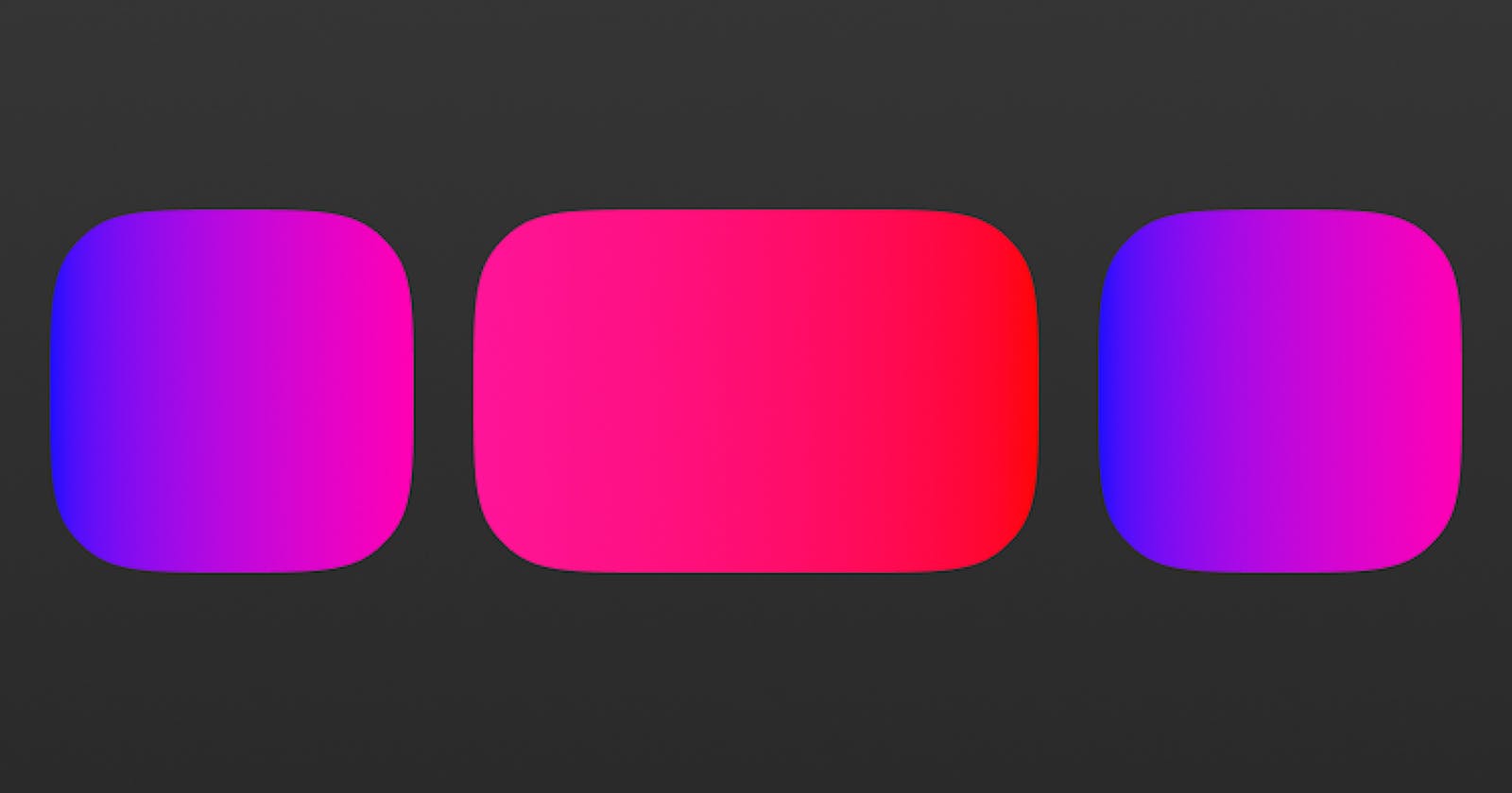
Here, we are using CSS's mask property to create a smooth "squircle" shape for an image. The HTML code sets the image source and adds the class "mask mask-squircle" to the img tag.
The CSS code first sets some general properties for the mask class, such as the size, repeat, and position of the mask. These properties ensure that the mask is contained within the image, is not repeated, and is centred on the image.
Then, we create a new class called mask-squircle which applies the actual squircle mask to the image. The mask is defined as an SVG path with a specific encoding and is applied to the image using the -webkit-mask-image and mask-image properties.
As a result of this code, the image will be displayed with a smooth squircle shape, thanks to the use of the mask property. Note that this code uses vendor prefixes for webkit browsers, so it will work well across most modern browsers.
It's also worth noting that the mask property is not supported in all browsers, so it's important to use a fallback for unsupported browsers. One such fallback is the clip-path property, which works in a similar way to the mask property and can be used to create rounded edges and shapes.
To use the clip-path property as a fallback for the mask property, you can add the following code:
.mask-squircle {
    -webkit-mask-image: url(data:image/svg+xml;base64,PHN2ZyB3aWR0aD0nMjAwJyBoZWlnaHQ9JzIwMCcgeG1sbnM9J2h0dHA6Ly93d3cudzMub3JnLzIwMDAvc3ZnJz48cGF0aCBkPSdNMTAwIDBDMjAgMCAwIDIwIDAgMTAwczIwIDEwMCAxMDAgMTAwIDEwMC0yMCAxMDAtMTAwUzE4MCAwIDEwMCAwWicvPjwvc3ZnPg==);
    mask-image: url(data:image/svg+xml;base64,PHN2ZyB3aWR0aD0nMjAwJyBoZWlnaHQ9JzIwMCcgeG1sbnM9J2h0dHA6Ly93d3cudzMub3JnLzIwMDAvc3ZnJz48cGF0aCBkPSdNMTAwIDBDMjAgMCAwIDIwIDAgMTAwczIwIDEwMCAxMDAgMTAwIDEwMC0yMCAxMDAtMTAwUzE4MCAwIDEwMCAwWicvPjwvc3ZnPg==);
    clip-path: url(data:image/svg+xml;base64,PHN2ZyB3aWR0aD0nMjAwJyBoZWlnaHQ9JzIwMCcgeG1sbnM9J2h0dHA6Ly93d3cudzMub3JnLzIwMDAvc3ZnJz48cGF0aCBkPSdNMTAwIDBDMjAgMCAwIDIwIDAgMTAwczIwIDEwMCAxMDAgMTAwIDEwMC0yMCAxMDAtMTAwUzE4MCAwIDEwMCAwWicvPjwvc3ZnPg==);
}
This will ensure that the image is displayed with a smooth squircle shape even on browsers that don't support the mask property.
DEMO
%[INVALID_URL]
In conclusion, the mask property is a powerful tool that can be used to create a smooth border-radius effect in CSS. With a little experimentation and some creative thinking, you can use the mask property to create visually appealing websites that stand out from the rest. Be sure to use a fallback such as the clip-path property for browsers that do not support the mask property.