BEM methodology - CSS best practices
Block, Element, Modifier methodology (commonly referred to as BEM) is a popular naming convention for classes in HTML and CSS.


We all know naming a class is always been a headache but using BEM we can avoid name collisions and reduce the pain of modifying CSS classes when changes are needed to be made. While working with the larger project is hard to keep track of each class name so it's always been helpful to follow some patterns and that's why many companies use BEM methodology in their projects.
Here’s an example of a BEM convention:
/* Block component */
.btn {}

/* Element that depends upon the block */
.btn__register{}

/* Modifier that changes the style of the block */
.btn--primary{}
.btn--secondary {}
Let me explain what I knew about BEM:
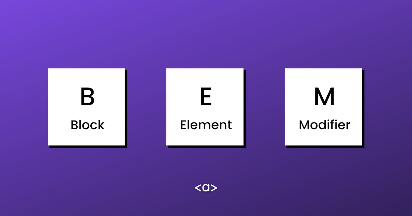
B - Block
Block is an independent, reusable and standalone part of the design. Blocks can be nested in each other.
  <a class="btn" href="https://css-tricks.com">
  <span>$9.99</span>
  <span>Subscribe</span>
</a>
Here we have two blocks first is hero and the second is btn which is nested within the hero block.
E - Element
Element belongs to a block and can not stand alone. Simply it can not be used outside of the block that it belongs to. Elements can be nested inside each other. CSS class is formed as block name plus two underscores plus element name.
  <!-- btn block -->
<a class="btn" href="#">
<!-- icon element belongs to btn block -->
  <i class="btn__icon fas fa-thumbs-up"></i>
<!-- text element belongs to btn block -->
  <span class="btn__text">Like</span>
</a>
M - Modifier
Modifiers are used to change the default behaviour or state of an element or block. Also, the Modifier is not standalone, meaning it can not be used outside of blocks that they belong to. They show what size, how different or how do they behave from default ones. CSS class is formed as block name plus two 'minus sign' plus element name.
<button class="btn btn--primary">Primary Button</button>

<button class="btn btn--secondary">Secondary Button</button>
Here btn--primary and btn--secondary are the modifier of button elements these two modifiers pass a different background color for each button
Which is a good thing because here we save some line of code by not defining btn again and just changing .btn class skin by using modifiers
How to apply BEM name.
Cheatsheet
- Block: hero
- Element: hero__cta
- Modifier: hero--dark
Summary
To wrap things up I thinks BEM is very useful while working with a team it provides a method for constructing scalable and maintainable interfaces where everyone on the team should have a clear idea of how things can be improved.
BEM is not about building it's about maintaining